The Delivery Partner App helps delivery partners move orders from pharmacy pickup to customer handoff with clear actions, timely information, and fewer decisions to make along the way.
Turn a complex operational workflow — orders, locations, deadlines, payments, verification, and exceptions — into an experience that feels simple when delivery partners are on the move.
A delivery partner doesn't just deliver an order — they manage a chain of decisions.
From accepting an order to pickup, navigation, payments, verification, and handling exceptions, every delivery involves multiple steps. The challenge was to simplify this complexity and help delivery partners stay informed and focused on the next action.
Understanding the delivery journey before designing the experience.
We mapped the end-to-end delivery workflow and identified the operational requirements, decision points, and edge cases that delivery partners need to handle on the road.
From a complex delivery workflow to a focused mobile experience.
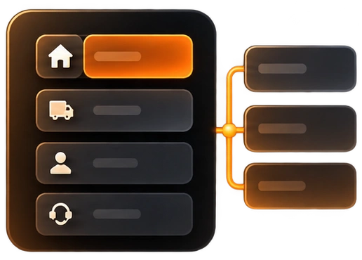
I structured the experience around the delivery partner's journey, then translated each operational step into clear flows, simple interactions, and scalable UI patterns.
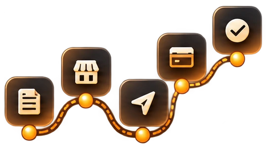
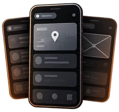
Turns a complex delivery into one clear next step. From pharmacy pickup and navigation to payment, verification, and completion, the app surfaces the action needed at each stage.
Not every delivery goes as planned. The app gives partners clear paths for customer unavailable, refused orders, rescheduling, re-attempts, and returns — so exceptions are handled without breaking the delivery flow.
Keeps customers informed at every step with live tracking, accurate ETAs, and instant status updates — building trust and reducing "where is my order?" calls.
Add a summary of the improvements and outcomes this design delivered. Use real metrics only if available — leave the cards below as notes otherwise.
Designing for partners who use the app on the move, often one-handed and under time pressure. Every screen had to balance a lot of operational detail (orders, addresses, deadlines, payment and verification) without slowing them down. Exceptions such as failed deliveries, refusals and returns needed clear paths that did not clutter the everyday flow.
In operational products, clarity beats features. Building the experience around the next action, instead of around data, made each stage easier to follow. Mapping the real delivery workflow before designing screens surfaced edge cases early and kept the flows grounded in how partners work.
Run usability sessions with delivery partners in the field to validate the flows under real conditions. I would also explore smarter prioritisation for multiple orders, offline support for low-connectivity areas, and clearer earnings and performance insights.
Let's
design & build
something great.